
Now a major trend: Information visualization for everyone
New York Times has a nice article on the collaborative information visualization tool Many Eyes. I wrote about Many Eyes in a post titled the magic of data visualization for everyone when the site was originally launched in January 2007. My post began:
Every day I am amazed afresh by the transformative power of the Web. Today I have discovered Many Eyes, a site hosted by IBM’s AlphaWorks. It combines open participation with a wonderful set of visualization tools. As such anyone can upload data sets, and then create sophisticated visual representations of those data sets, including scatterplots, tree maps, histograms, bubble diagrams, network maps and far more. Anyone can then either reuse the data sets, create new visualizations, add comments, or blog about the visualizations.
The basic functionality of the site hasn’t changed much since the launch, though it’s great to see not only that it’s being used extensively, but also getting significant attention and being used in new and unexpected ways.
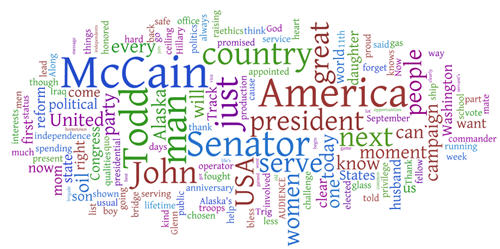
Want to make sense of the latest political speech? Use the Wordle visualization tool on Many Eyes to pull out the themes, as in the representation above of Sarah Palin’s self-introduction as McCain’s running mate.
The article quotes Ben Shneiderman, a professor at the University of Maryland, on how information visualization is being democratized:
“The gift of the Internet is that everyone can participate, and the tools can be brought to a much wider audience,” he said.
Presenting results in a static spreadsheet or table may do the job. “But sometimes it’s like driving with your eyes closed,” he said. “With visualization, it might be possible to open your eyes and see something that will help you” — for instance, patterns, clusters, gaps or outliers in the data.
“The great fun of information visualization,” he said, “is that it gives you answers to questions you didn’t know you had.”
As discussed in my post on Many Eyes last year, I’ve been writing for over a decade on the importance of information and concept visualization, and over the last years I have created a wide range of visual frameworks and representations.
It’s hardly news that the inexorable increase in the amount of information available is making information visualization a critical tool, not just for analysts and researchers, but absolutely for everyone.
What is new is that information visualization is becoming a mainstream tool. Just as we now expect primary schoolchildren and their grandparents alike to be familiar with search engines, we will soon expect everyone to be familiar with information visualization tools. Certainly one of the important elements of next-generation search is visualization. The rise of information visualization in mainstream newspapers and magazines over the last years means that people now realize that it information is far easier to comprehend visually, and that many more tools are possible than the bar and pie charts available in Excel. Certainly information visualization should be part of the school curriculum, to prepare people for a world in which these will be central tools in their work.
We can now declare information visualization a major trend that will shape how we work and interact with the world over the next years and decades.