Announcing my new book Thriving on Overload!

By

I am delighted to share that my book Thriving on Overload is being published by McGraw-Hill, and is available for pre-order for its availability on September 6, 2022.

It has been a long journey

It has been far, far too long since my last book. After writing Developing Knowledge-Based Client Relationships, Living Networks, Implementing Enterprise 2.0, and Getting Results From Crowds I got caught up in an over-ambitious set of ventures and then a period as co-founder and CEO of a new startup group as well as life transitions.

Read more

Decline of News-on-paper: United States

By

Mapping the decline of news-on-paper

[Latest update: December 15, 2017]
The Newspaper Extinction Timeline, released in 2010, predicted that news-on-paper would become “insignificant” in the U.S. Read the Review of the Newspaper Extinction Timelinefor full context.

This page compiles some of the most recent available data on the state of news-on-paper in the U.S. Note that there are massive challenges to gaining an accurate current view of the state of news-on-paper.

  • The Newspaper Association of America (now renamed News Media Alliance) stopped providing detailed industry information in 2013.
  • Publicly listed news organizations have been largely very opaque in providing details on their print revenue and circulation.
  • Almost all so-called “newspaper circulation” figures available include both paper and digital formats. Most of the data below includes both paper and digital so does not provide real insight into the state of news-on-paper.

However the most important issue is NOT the decline of news-on-paper, but from the position we are in today how we can best create a positive future for the news industry over all channels.

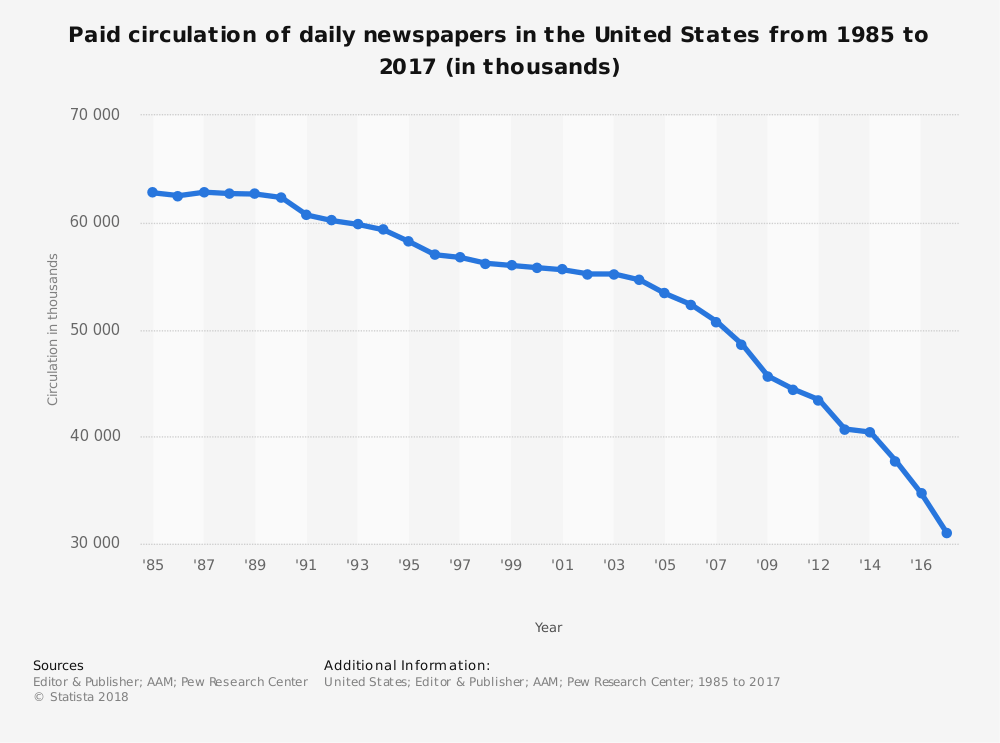
More than a 1/3 of paid daily newspaper circulation has disappeared over 10 years

At the turn of the century, newspaper circulation in the United States rested at a relatively stable level of approximately 55 million copies a year. Nevertheless, ever since peaking in the late 1980s—hitting 62.82 million in 1987—the circulation of paid daily newspapers has consistently declined.

[NOTE: Figures include both print and digital]

Data sources: Editor & PublisherAlliance for Audited MediaPew Research Center  Chart source: statista

The pace of decline accelerated in 2004 (54.63 million), but not precipitously, resulting in a drop of more than 36% by 2016 (34.66 million). According to the last ten years of recorded data (2006-2016) supplied in the chart above, paid daily newspaper circulation sunk 34%.  

To take a closer look at the yearly circulation numbers, statista provides an interactive version of the chart above as well as multiple options for downloading the information.

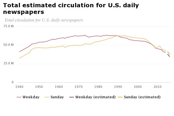
2016 circulation for both Weekday and Sunday editions has plunged to the lowest figures since 1945

[NOTE: Figures include both print and digital]

Data sources: Editor & Publisher (through 2014); estimation based on Pew Research Centeranalysis of Alliance for Audited Media data (2015-2016). Chart source: Pew Research Center

The Pew Research Center offers deeper insight into the decline of newspapers in the United States, providing separate circulation data for Weekday and Sunday daily newspapers. The center’s analysis shows that in 2016 both hit their lowest levels since 1945, with circulation figures of 35 million and 38 million respectively.

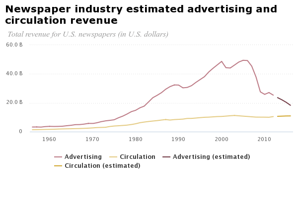
Advertising revenue dropped nearly two-thirds between 2005 and 2016, while circulation revenue rose slightly

[NOTE: Figures include both print and digital]


Data sources: News Media Alliance, formerly Newspaper Association of America, (through 2012); Pew Research Center analysis of year-end SEC filings of publicly traded newspaper companies (2013-2016). Chart source: Pew Research Center

The Pew Research Center also analyzed advertising and circulation revenue for U.S. newspapers over a 60-year period starting in 1956. Although circulation earnings have gradually increased, total advertising revenue fell significantly between 2005 and 2016. During these 11 years, total advertising revenue for the industry plummeted by nearly two-thirds, decreasing from $49 billion to $18 billion. The bulk of advertising revenue still comes from print, compromising approximately 80% in 2011 and dropping to close to 70% in 2016.

We recommend the valuable Pew Reseach Center website on Journalism & Media, which is compiled from a variety of industry resources.

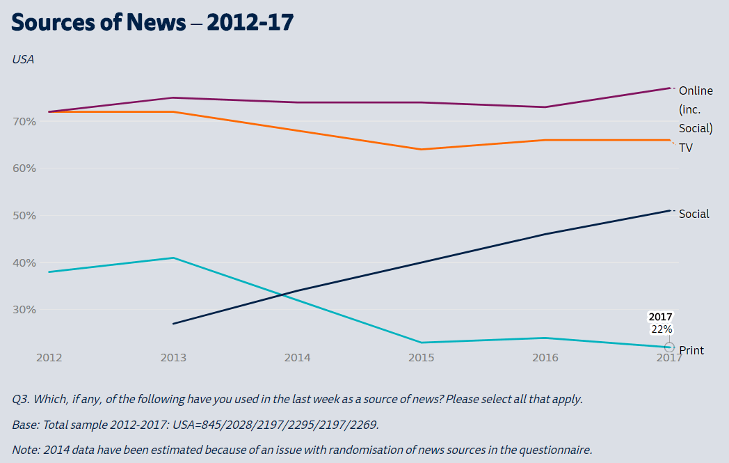
Print became the least popular news source in 2014, continuing to fall through 2017 down to 22% weekly consumption


Data and chart source: Reuters Institute Digital News Report 2017

From 2013 to 2017, the number of people who read print newspapers decreased by almost one-fifth. As the medium dropped out of favor, social media as a news source enjoyed a steady climb, with consumption growing by about 6% each year.

Each year since 2012, the Reuters Institute in partnership with the University of Oxford has released a digital news report offering insights into the transition to online news and its effect on the media landscape. Although the first report covered just five countries, the latest included survey data from 70,000 participants across 36 countries.

For people wanting to delve deeper and compare data between and within countries, we strongly recommend reading the latest report and using the interactive feature to create your own charts.

The New York Times, The Washington Post, and The Wall Street Journal are uniquely positioned to monetize print but its role is rapidly declining

The New York Times, The Washington Post, and The Wall Street Journal are distinct from other newspapers in the U.S. in that they are truly national and in fact arguably global “newspapers of record”. All three have made a concerted and successful shift to digital subscriptions and advertising. However, their role means that the role of print in their business models continues to be solid.

These uniquely successful news organizations recognize that they may not continue indefinitely on print. New York Times’ CEO Mark Thompson says in an interesting interview in Nieman Lab on when to stop the presses forever:

“The print product is a mature platform. It is, as you say, an economically important platform to us. It’s possible that platform will plateau. I think it’s more likely that the platform will eventually go away. It’ll go away because the economics will no longer make sense to us or our customers.”

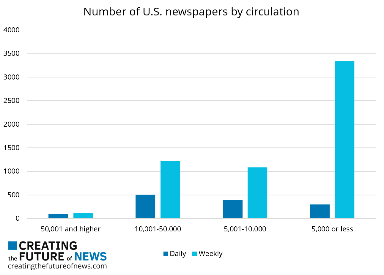
Weekly community newspapers are severely challenged but are likely to have further life

There remain many newspapers across the US, primarily weekly, with small circulations but advertising revenues that are sometimes not eroding as fast as larger newspapers due to their highly geographically focused audiences and unique content.

Data source: Editor & Publisher, American Press Institute, Columbia Journalism Review

An excellent report from Columbia Journalism Review’s Tow Center on Small-market newspapers in the digital age provides strong insights into the state of the sector and some of the ways community newspapers are successful responding to change.

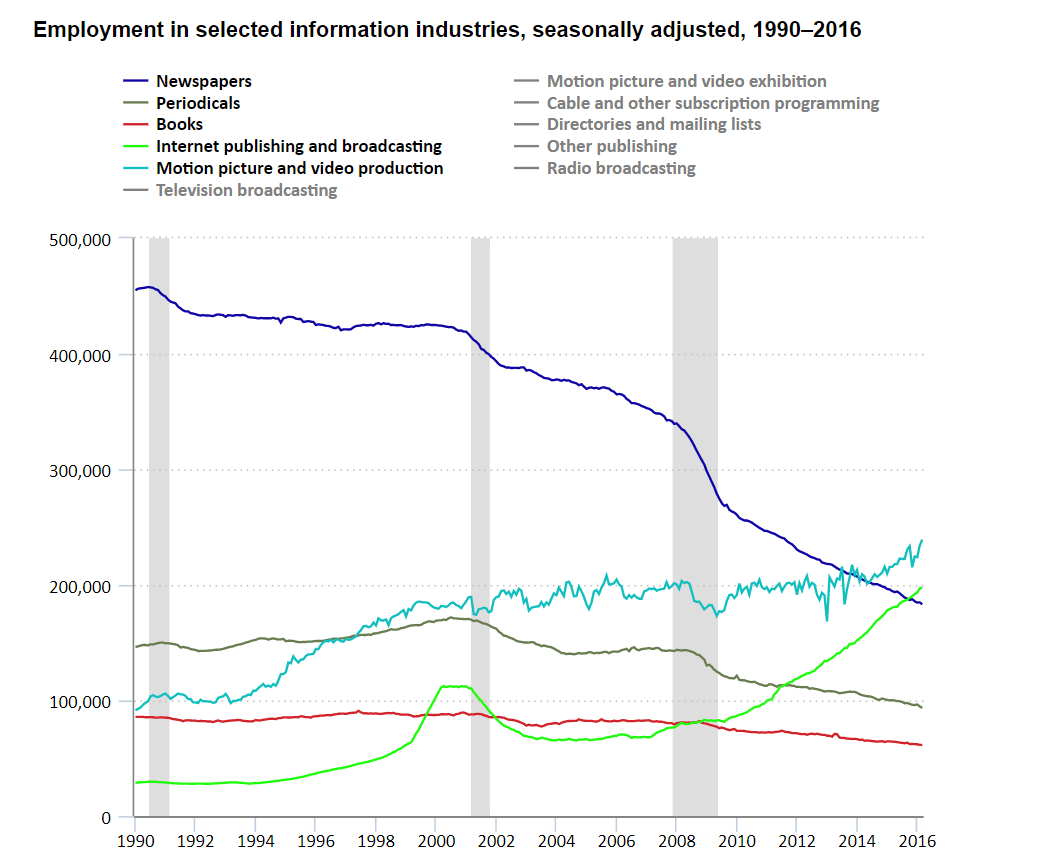
Since September 2005, employment in the U.S. newspaper industry has dropped by more than half

Note: Shaded areas represent recession, as determined by the National Bureau of Economic Research.
Data and chart source: U.S. Bureau of Labor Statistics 

U.S. Newspaper employment:
January 1990: 455,000 (62% decline since this date)
January 2010: 260,800 (33% decline since this date)
September 2016: 173,700

The U.S. Bureau of Labor Statistics also provides the above chart in an interactive format. Users can explore the data further by hovering their cursors over the lines representing the different information industries or by clicking on the “Chart Data” tab to view it in a table format.

NOTE: “Newspaper employment” includes staff working on both print and digital editions, a fraction of these figures work

How to Become a Data Journalist

By

First, the bad news: If you want to be a data journalist, odds are you’ll need to teach yourself. There are courses and organizations that can help, but journalism schools are only slowly adding data to their degree offerings. What’s more, if you’re reading this, you’re probably a journalist who wants to add data to your skill set. Going back to grad school may not be practical. One does not enroll in a design undergrad because one wants to learn how to use Photoshop, for instance.

Now, the good news: it’s possible to transform yourself into a data journalist. Here’s how:

1)    Pick a platform.

2)    Learn the basics.

3)    Tackle one example of each of the Big Three.

This is how those steps work in more detail:

Pick a platform

First step is picking your platform. You can take the traditional approach and just learn barely enough of a dozen different platforms to churn out a serviceable pie chart after an hour of bashing around and Googling everything, but I don’t recommend it. At a certain point, one must commit. This is one of those points. Figure out which software feels right to you, whether it be Tableau, Google Data Studio, Power BI, or some other platform, and go with it.

This choice may not be entirely up to you. If your newsroom has already done some data projects, you should probably get with the program and use whatever they’re already using. There are also plenty of other ways to visualize and analyze data than with the three I listed above. However, I’m operating under the assumption that you’re a reporter, and therefore probably do not find yourself in possession of coding skills, and that eliminates certain options like D3.

Learn the basics

Second step is learning enough of your chosen platform to get started. Most platforms come with their own tutorials, and you can also look to services like Lynda for training. Alternately, you can just dive into step 3 and try to learn through trial and error. Learning software this way is a bit like learning to swim by jumping in a lake and hoping things work out for the best, but experiential learners may find it’s the only approach that really works.

If your newsroom has any experience with data, your very first step should probably involve finding whichever reporters have done data work in the past, and wheedling them for help getting started. You can also hunt down a full-time data journalist outside your newsroom and ask them to mentor you. There’s a good chance they’ll go for it.

Data journalism can be a lonely, isolated life bereft of human sources to interview. In other words, many data journalists could use a break and some human contact. Reach out to one and see what they say. I’ve spent years trying to wheedle the journalists I work with into learning Tableau, with little success. Every single journalist who has come to me asking for help with training has received some variation of, “Absolutely! Of course I can help!”

Tackle one example of each of the Big Three

Third step is tackling the Big Three: elections, census, and economy. If you’re a journalist, you need to be able to cover elections, you need to be able to cover demographics, and you need to be able to cover economic issues. From these three basic types of data, most other types of analysis can be extrapolated.

Further, all three types are topics for which data should be fairly easy to find. Most countries have plenty of election data available, whether generated internally or externally. Same goes for census information and economic metrics.

In each case, you will follow the same basic production outline:

1) Hit Google and figure out which data is available on the subject. This is the most difficult step. Don’t be discouraged if you hit a wall early on–data is often surprisingly elusive. Keep trying. Be prepared to jump through some hoops even once you find the data. Many sources have a learning curve simply to figure out how to select or download their data.

2) Pull up the data you find in something simple like Excel, so you can see how the file is structured and what it contains. Figure out how the headers work. What do those column names mean? Are there any cryptic titles that need to be replaced with titles that make more sense? Is your dataset manageable in size? If you have more than 20 columns, it’s probably a poor choice for your first data project.

3) Clean your data, if needed. For your first training datasets, this shouldn’t be an issue. Try and just steer clear of dirty data right now. When dealing with data, anything that’s wrong is “dirty.” For instance, if you have two alternate spellings of the same person’s name in your dataset, that’s “dirty” data because your software will treat those two spellings as different people. When you’re first starting out, you should seek out simpler datasets with few or no mistakes. You want to have a firm footing in your platform of choice before you try and tackle really messy data sources. These types of sources can easily lead to errors in your analysis and conclusions.

4) Figure out the question you want to answer. Think about which columns (which data) you’ll need to answer that question. What sorts of views make sense? Is there a geographic component? Time component? Both?

5) Open your data in the data platform of your choice. If you decided to go with something Excel-based, like Pivot Tables, you can pat yourself on the back at this point for having saved yourself a step.

6) Start to answer your question from step 3. Remember that most visualizations begin life looking homely and unintelligible. It takes time to shape them. Be prepared to make multiple visualizations looking at the data different ways, and throw away those that don’t do anything useful. Often your finished product will be a dashboard with multiple views on the same page, and it’s normal to build more views than you need as you’re exploring your data. There’s nothing wrong with throwing away a third of the views you construct by the time you publish. This is perfectly normal.

7) Decide whether you’ve answered your question. If you have, see if that answer leads to any more questions–or if you’ve stumbled across any other interesting questions as you’ve worked through what you have. The side questions are frequently the most interesting.

8) Go show your results to someone. Their response can be anything from shocked astonishment at your feat to bored indifference. Bear in mind that just because you blow someone’s mind, that doesn’t mean you’re necessarily a genius. (But it certainly does encourage you to go out and keep analyzing.)

Strength in Numbers

Once you’ve tackled the Big 3, you should have enough familiarity with your chosen data platform to see whether data is for you. Many journalists are math phobes, and find numbers intimidating. It’s okay if you feel out of your depth. Bear in mind that as well as being scary, numbers can be transformative. Presented properly, they lend credence to your stories in a way that no amount of good prose can match.

One of the standby rules of writing states, “Show, don’t tell.” Data visualizations are the ultimate expression of this rule. They sit alongside our words and show the audience the numeric truth in what we report. This is of tremendous value to us, our work and our audience. In a world where credibility is a continuing challenge, we could all use some authoritative weight to throw around. Data can be that weight.