
Our 6 favorite infographics of 2010
I’ll try to fit in a few summary posts from the year before I head off for holidays. To kick off here are our favorite infographics that we’ve launched this year, in chronological order. Click on the images for the original posts. Quite a few of these got a lot of attention!

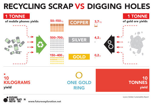
Used mobile phones yield 1000 times more gold than gold ore
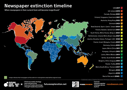
Newspaper Extinction Timeline
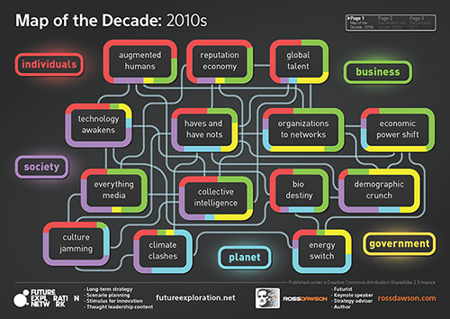
Map of the Decade and Zeitgeist for 2011
Lots more visualizations coming next year!!