Twitter network analysis of events – what’s possible?
I recently connected with Daniel Knox (@djkn0x) on Twitter – which is where it seems most of my connections are happening these days. Among other interesting entrepreneurial activities Daniel is playing with a new venture that does analysis of Twitter activity around events.
To show me Daniel created a visual network analysis of the Twitter activity around Future of Crowdsourcing Summit (#foc10) that we ran a few weeks ago in Sydney and San Francisco.
Here is the explanation of the diagram that Daniel gave me:
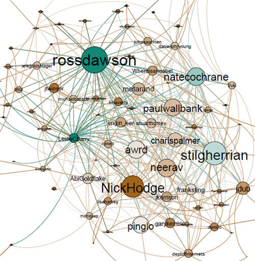
Here is a simple visualization of the #FOC10 tweeters. In the visualization the size of the node indicates the inbound connections (in-degree), while the color of the node represents the outbound connections from low (orange) to high (green). So if you compare yourself and @NickHodge, you both have a similar number of inbound #FOC10 connections (i.e. are followed by a similar number of people who used the #FOC10 hashtag), but you have far higher outbound #FOC10 connections (i.e. you follow a greater number of people who used the #FOC10 hashtag than @NickHodge does). In terms of the overall network graph parameters, the network diameter (i.e. the maximal distance between any two nodes in the #FOC10 network) is 5, and the average network distance (i.e. the average number of steps along the shortest paths for all possible pairs of nodes in the #FOC10 network) is 2.2. These are slightly lower than we’re seeing in other conferences suggesting the #FOC10 tweeters are part of a relatively close network.
Daniel also provided the following stats:
• Top tweeters using #FOC10: @natecochrane (38 #FOC10 tweets), @amylyden (29), and @kobygeddes (24)
• Top people mentioned in #FOC10 tweets: yourself (32 mentions), @natecochrane (30), @stilgherrian (24) and @NicholasGruen (17)
• Top url shared in #FOC10 tweets was the BBC story “Crowdsourcing work: Labor on demand or digital sweatshop?”
And this wordcloud (which you can zoom in on and move around):
Given that it was a highly compact two-hour event without a massive audience, the outcomes of some of the basic analysis is not surprising, though the network diagram certainly provides interesting perspectives. For larger and longer events the insights would be a lot more useful and practical. In fact, this kind of Twitter aggregation is itself a form of crowdsourcing.
There are many, many ways that effective Twitter analysis could be highly valuable for events. A few that spring to mind are:
* Identifying key people in pre-event conversation, allowing organizers to support their role as conversational connectors
* Seeing what discussion themes emerge before the event, helping to shape the agenda
* Identifying sentiment during sessions and relative sentiment across concurrent sessions to help people choose where they want to go
* Picking out emerging themes and discussions for development on stage, forum, Twitter or other spaces
* Seeing natural communities that exist pre-event and helping them to connect between themselves and to other like-minded people at the live event
* Seeing natural communities that emerge during the event and helping them to connect during and after the event
* Curating the event content so that the most interesting and relevant parts are available to non-attendees in an intuitive format
Of course, the richer the density of Twitter usage at an event, the more that is possible. Certainly being able to show people that their tweets were valuable in a number of ways to support the event would help make more people participate.
What other thoughts do you have on how Twitter analysis could be used to create better events? Or if you were at #FoC10, what other analysis would you like to have seen?
To help develop the service Daniel has offered to provide analysis to any events running before the end of the year – contact him on dknox [AT] mit.edu or @djkn0x.