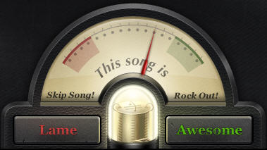
Why Turntable.fm’s Lame/Awesome button is awesome
Turntable.fm has certainly created a sensation – over the last couple of weeks it has been one of the hottest topics on the web.
Deservedly. It really changes the game in making music truly social. And the concept, the strategy, and the execution are superb.
One of the things is really well conceived is their Lame/ Awesome button which shows on every channel. The net of positive and negative views is highly prominent, encouraging everyone to rate the song.

If the balance swings too far down, the song is voted off and the channel skips to the next song. It is similar to the skip on other web radio, except it requires collective opinion.
This creates interesting dynamics across the rooms, converging music taste, established cliques voting off newcomers or voting up their friends, and a good reason to discuss in the chat panel why you like the music or not. It is at the heart of what makes the music social.
The vote panel is also visually very strong, with a nice retro dial feel, chunky buttons, and danger zones for the dial to move into.
Altogether a great example of web design.
